PawoonOverhauling a Cloud POS Used by Thousands of Merchants
- Company
- Pawoon
- Period
- 2016–2018
- Role
- UI/UX Designer. First designer, leading product design and UX research
- Shipped
- Pawoon 2.0, across POS, back office and waiter app
Context
Pawoon is a cloud point-of-sale system that helps small merchants run and monitor their business. I joined in early 2016 as one of the first five employees and the only designer, and watched the company grow from five people to hundreds and raise a Series A by 2017. The MVP I inherited worked, but it had been built without design thinking: usability issues throughout, and a visual identity out of step with the company's brand. My mandate was to rebrand it, fix the usability problems, and lift the overall experience to drive growth.
The problem
The product served three very different users (business owners, cashiers, and waiters), and each hit friction: a UI that didn't match the brand, a cluttered product-management page, error-prone registration, and too few merchants ever adding their first product.
What I did
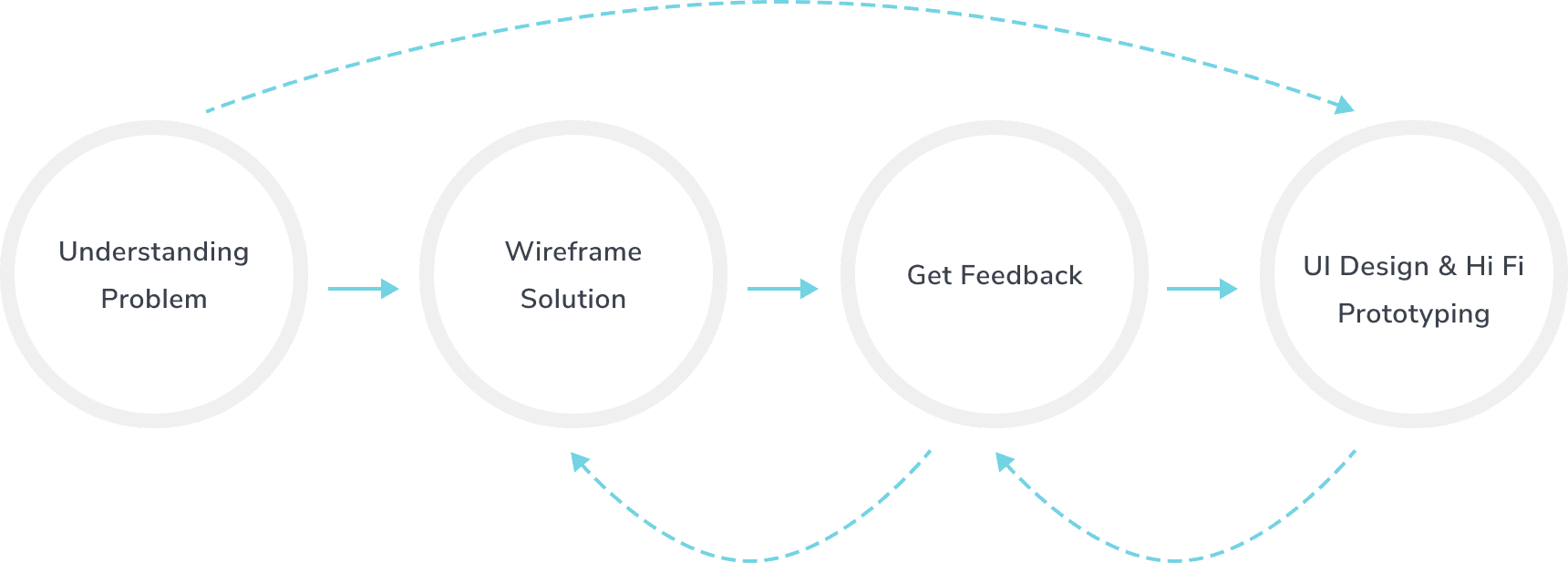
- Matched the process to the problem: quick fixes went straight to UI and prototyping, while complex flows started as wireframes for early feedback.
- Chose each research method to fit the situation and the goal, rather than running the same playbook every time.
- Built interactive, clickable wireframes in Axure RP to model the complex back-end system and validate concepts fast.
- Tested those prototypes with real users for usability feedback, then moved to high fidelity once the concept held up.
Methods and tools. UX Research, Wireframing, Axure RP, UI Design, Prototyping
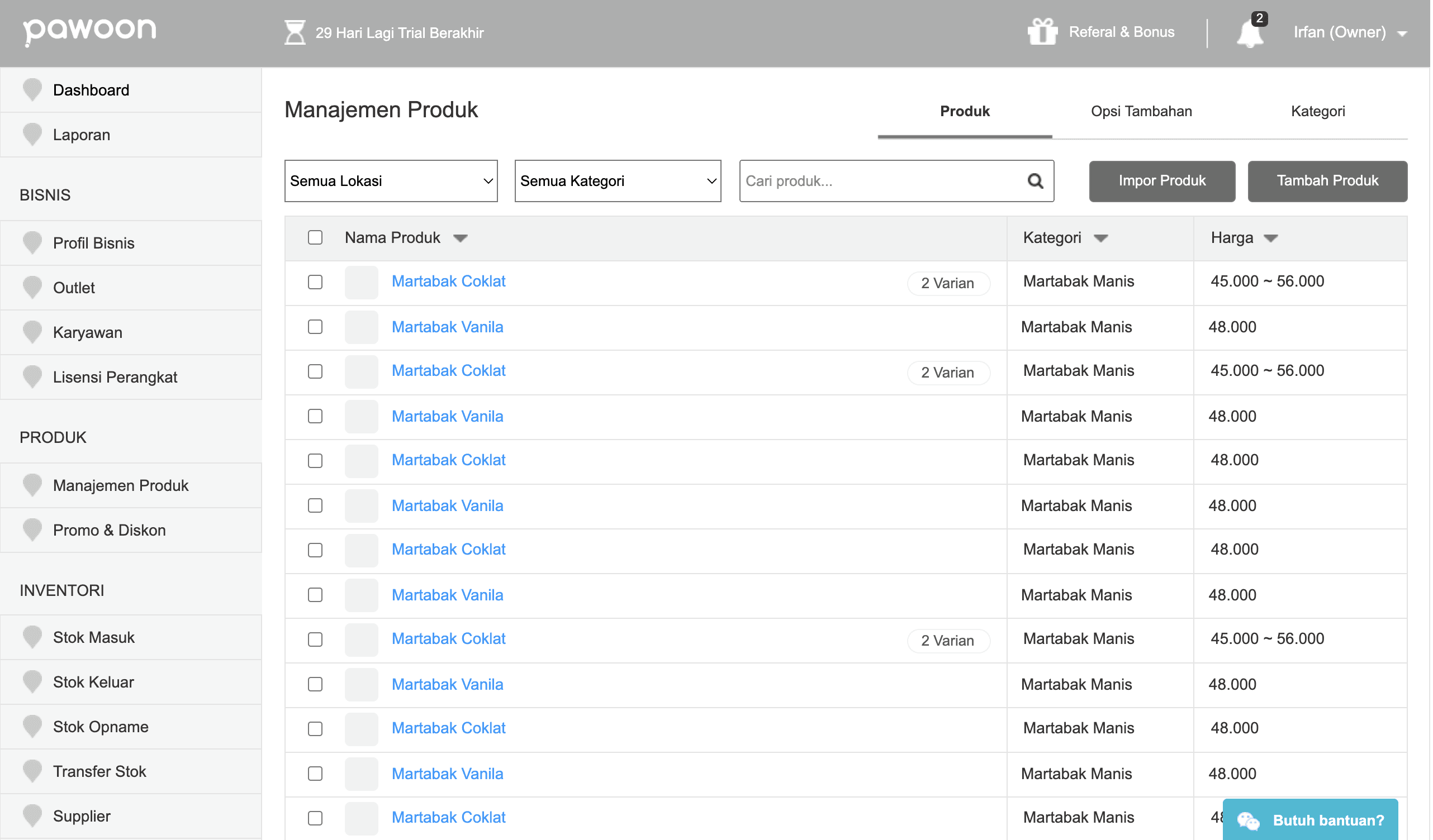
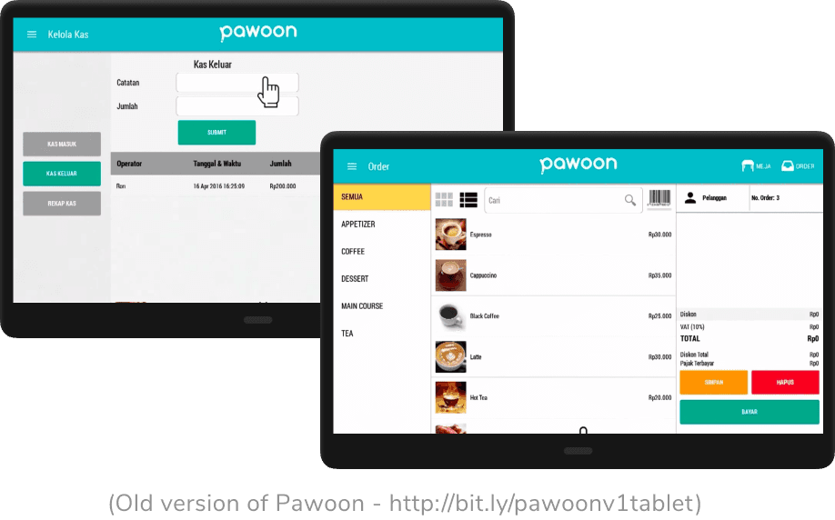
The app's look and feel didn't match Pawoon's brand values.
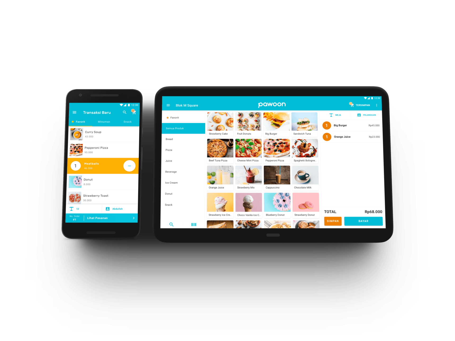
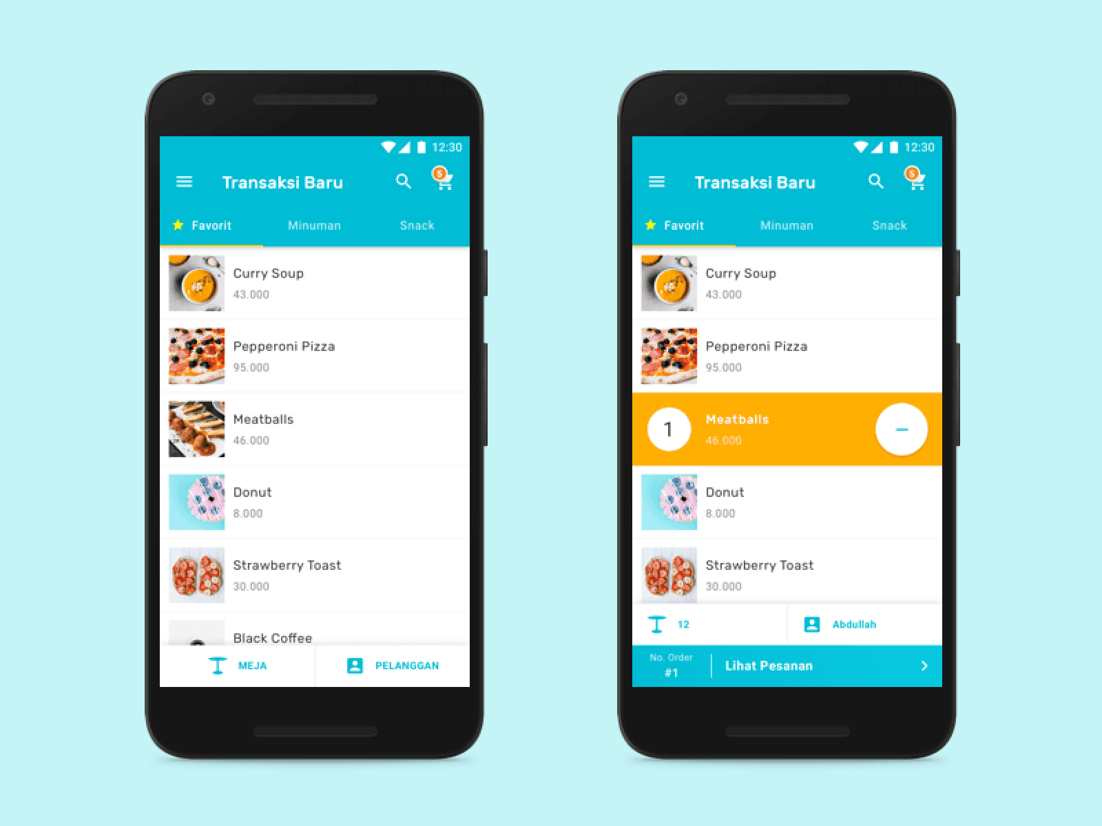
Pawoon wanted a point of sale that felt simple and professional but still young and casual, since many of its users were young. After agreeing the direction with the CEO, I redesigned the look and feel around the company's brand and colors, simplified UI elements, and hid rarely-used ones, making the search bar optional (observation showed it was used only occasionally) to save space.
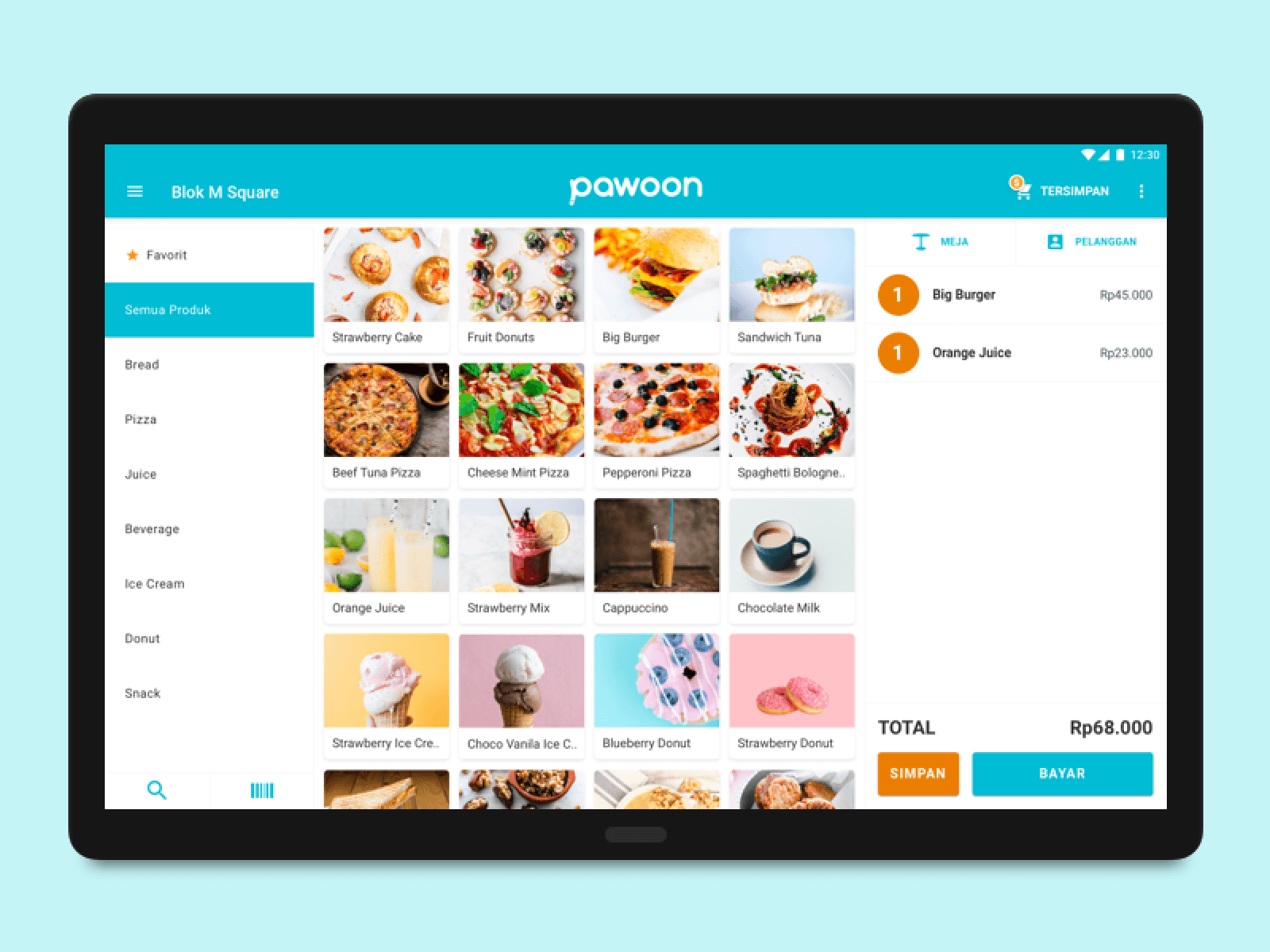
Showing after: The redesigned Pawoon tablet POS: a photo-led product grid with category filters on the left and the live order total on the right.
- 1Search folded into an icon. Observation showed cashiers rarely used it, so the space went to products.
- 2Photo-led product grid in the brand's cyan, replacing a grey text list.
- 3The running order and its total stay in view while items are added.
The add-product page, one of the back office's most critical, was a long, poorly categorized form with real usability issues.
I applied progressive disclosure: prioritizing the most important fields in the hierarchy, hiding lower-priority ones while keeping them reachable, and adding tooltips to explain each field. Hotjar session recordings afterward showed a clear usability improvement over the old version.
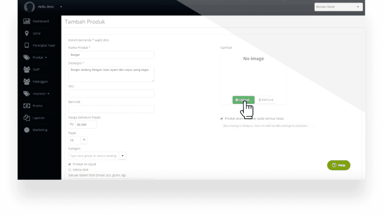
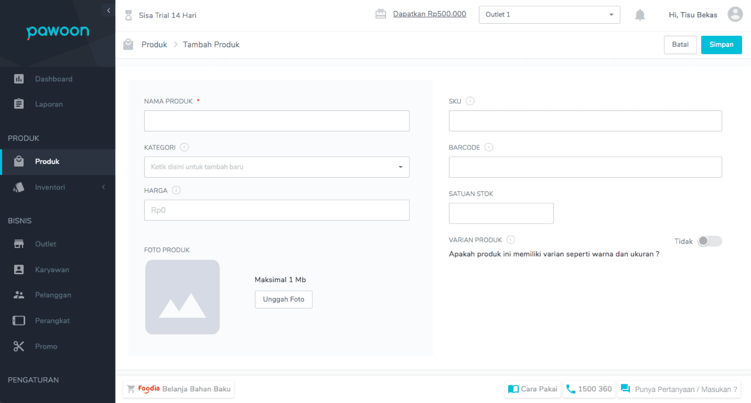
Showing after: The redesigned add-product page using progressive disclosure, prioritizing key fields and adding inline tooltips that explain each one.
Users frequently mistyped their email during registration, which created work for the team and drove up support tickets.
I added a confirmation step: after the sign-up form is submitted, the flow asks the user to check that the email they entered is correct before continuing.
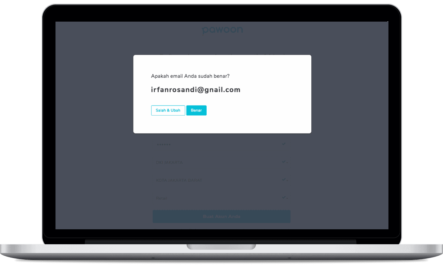
Too many new accounts never added a product, and without one, a merchant can't sell or even try the POS.
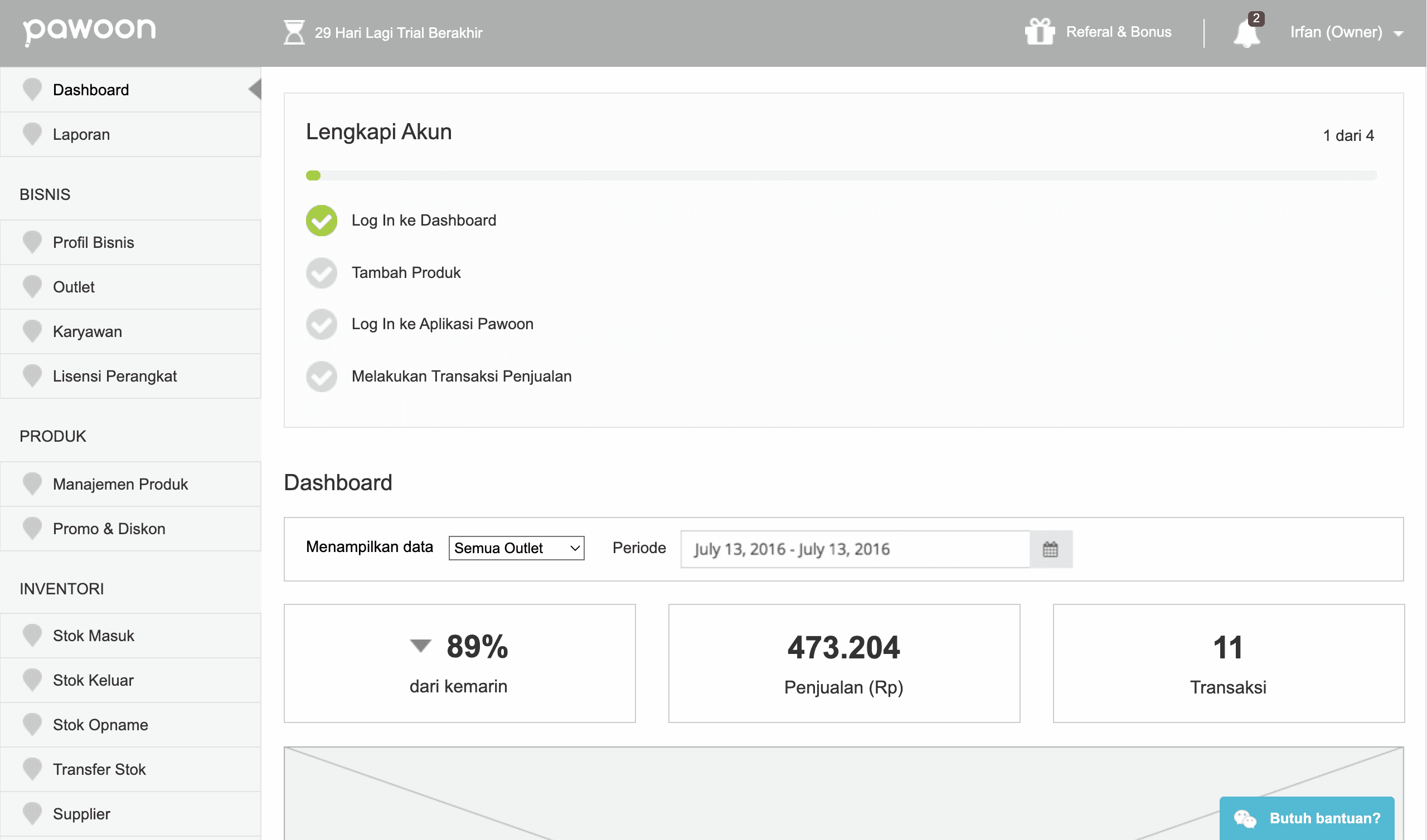
I moved product creation into onboarding, requiring only a product name, with category, price, and photo optional. Every merchant then lands on the dashboard with at least one product to sell and learns that anything added in the back office appears in the POS app. First-product-added rates improved after the change.
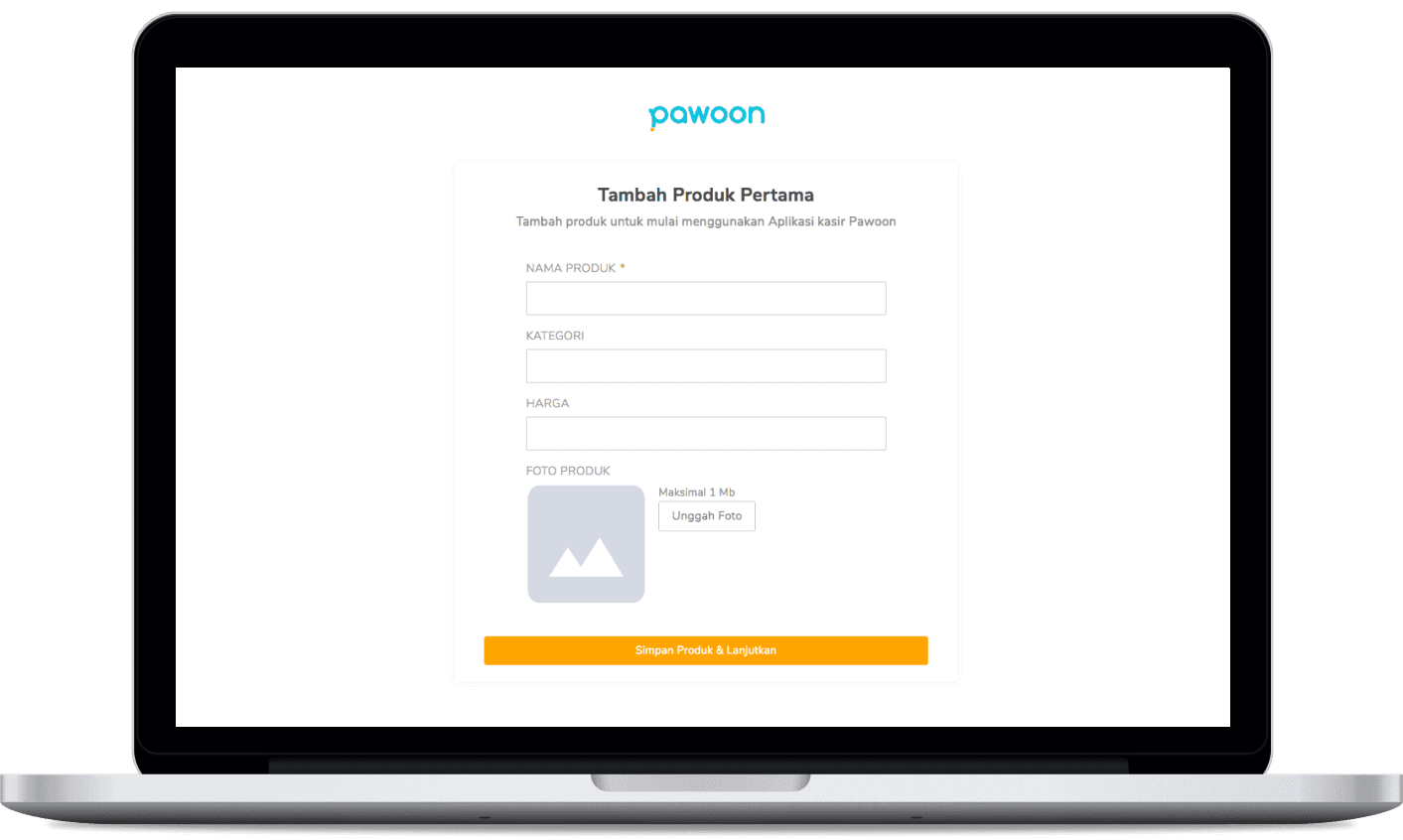
What changed
Pawoon 2.0 shipped as a full rebrand and UX overhaul of the core products. The changes, validated through Hotjar session recordings and reflected in a higher first-product-added rate, contributed to user-acquisition growth and reduced churn.
- 3 products across web, mobile, tablet
- Contributed to acquisition growth
- Reduced churn after revamp
What I learned
- UX research is essential when designing a product, especially for B2B or SaaS. It validates assumptions and keeps you from building something nobody needs.
- Every customer wants something different, so prioritize the feedback that creates the most positive impact for the majority of users.
- A metric matters, but understanding why the number moved matters just as much.
“His customer-centric approach, his UI/UX knowledge, his sense of responsibilities and his inter personal skills make him a invaluable team member.”